Gantt Diagram with Microsoft Excel
How to visualize a project
Reading Time: 6 minutes
When organizing and managing a project, it can be helpful to graphically represent the tasks to be performed as a function of time. Having a chart that clearly and simply shows the sequence of work to be done can facilitate project management and improve many aspects of the project itself such as resource allocation, timing, priorities, sequencing and more.
This is where the Gantt chart comes in.
This is a very useful chart but often its apparent complexity can be scary. In reality it is very easy to make and there are plenty of software, apps and sites that give you the ability to do this and many of them are also free.
Before downloading some software or signing up for some site let’s try to create it ourselves with what we already have available.
To be able to make a Gantt chart that represents a project we must have clear all the activities to be carried out and know the beginning and end. From experience I can assure you that you don’t always start with totally clear ideas and so putting them on a diagram helps a lot to clarify our ideas and improve the project itself.
Here I’ll explain how to make a Gantt chart with our Microsoft Excel. The graph that will come out will be very simple and will not contain all the information of a traditional diagram but it will be equally useful to be used in our projects.
HOW TO BUILD A GANTT DIAGRAM
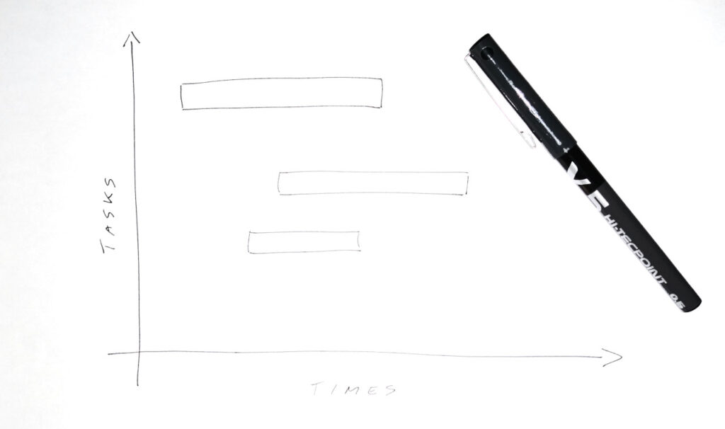
The Gantt chart is a 2-dimensional graph.
Along the horizontal axis we report times based on the logic of our project. We can indicate hours, days, weeks, months, years) and it depends on our time horizon. Along the vertical axis we report the list of activities.
Now, for each activity, we report a horizontal bar starting from the start date of the activity and as long as the duration of the activity.
REALIZE A GANTT DIAGRAM WITH EXCEL
To make a Gantt chart with Excel we need to follow a few simple steps.
STEP 1: Let’s create the data table
Everything starts from the data and therefore from a table.
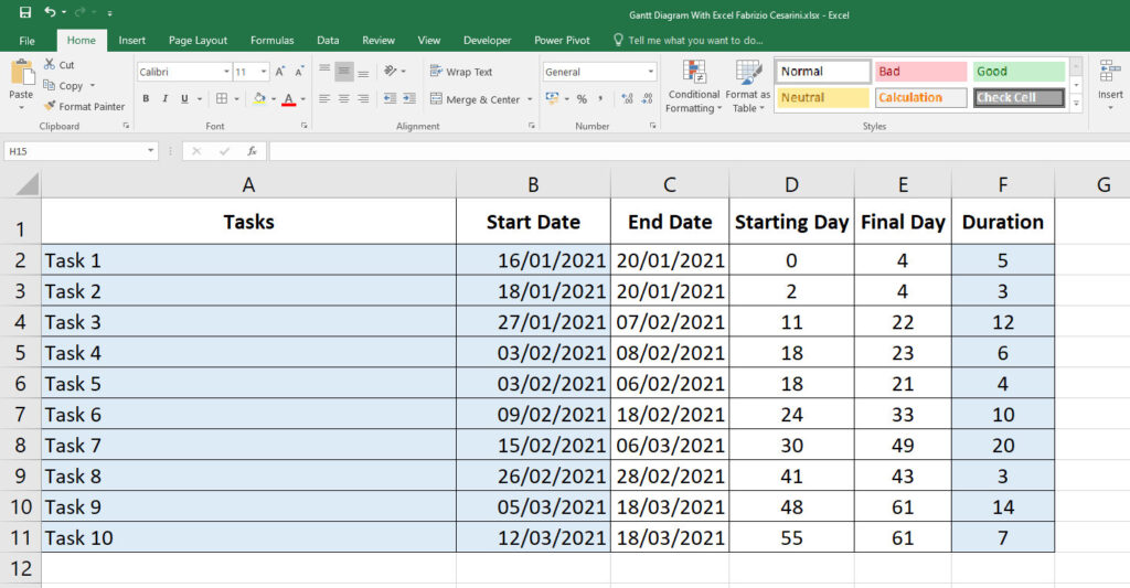
In our case, we need to create a table with the list of all the activities and for each item indicate the start date and the expected duration. For the sake of convenience, let’s add the other columns which we will need later and which will contain all the calculated values.
The fields of the table are the following
- Tasks
- Start Date
- End Date
- Starting Day
- Final Day
- Duration
In figure 3 you find the example used for this article.
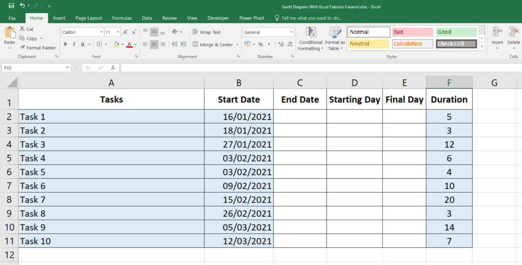
For the moment we only need to insert the columns Tasks, Start Date and Duration (expressed in days) and that in figure 3 you find colored in light blue.
STEP 2: Adding formulas to the table
Let’s calculate the columns that we left blank and that will be useful for the construction of the chart.
The first column to be calculated is “End date” and represents the day when the activity started in cell “Start Date” ends and its duration is indicated in cell “Duration“.
The calculation is very simple. Just take the start date, add the number of days indicated in the duration and subtract the number 1. This is necessary to consider the start day as one day of the duration.
So the formula to enter in cell C2 will be as follows:
C2 = B2 + F2 – 1
Where
B2 contains the Activity Start Date
F2 contains the Duration of the activity
Just drag down the formula to copy it to the other cells.
Inside the “Start Day” column we need to calculate the start day of the activity. To do this we find the internal number of the day of the start date of the activity from which we subtract the internal number of the start date of the first activity. The formula becomes:
D2 = INT(B2) – INT($B$2)
Where
B2 contains the date of the current activity
$B$2 contains the date of the first activity
The formula will have to be dragged in all other cells of the column
In the “Final Day” column we will calculate the number of the final day of the activity in a similar way to the previous cell. To do this we use the formula
E2 = INT(C2) – INT($B$2)
Where
C2 contains the date of the end of the activity
$B$2 contains the start date of the first activity
Also in this case the formula will have to be dragged in all the other cells of the column
In figure 4 you can see the final result of the table with our example data
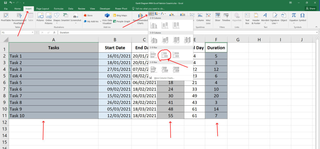
STEP 3: Inserting the Graph
Once the data table is finished we can go to create the corresponding graph.
We only need 3 columns and so we go to select “Tasks“, “Starting Day” and “Duration“.
Then we select the “Insert” panel and click on the bar chart icon and when the list of available charts appears, we need to select the “Stacked Bar” type. The steps are highlighted in figure 5
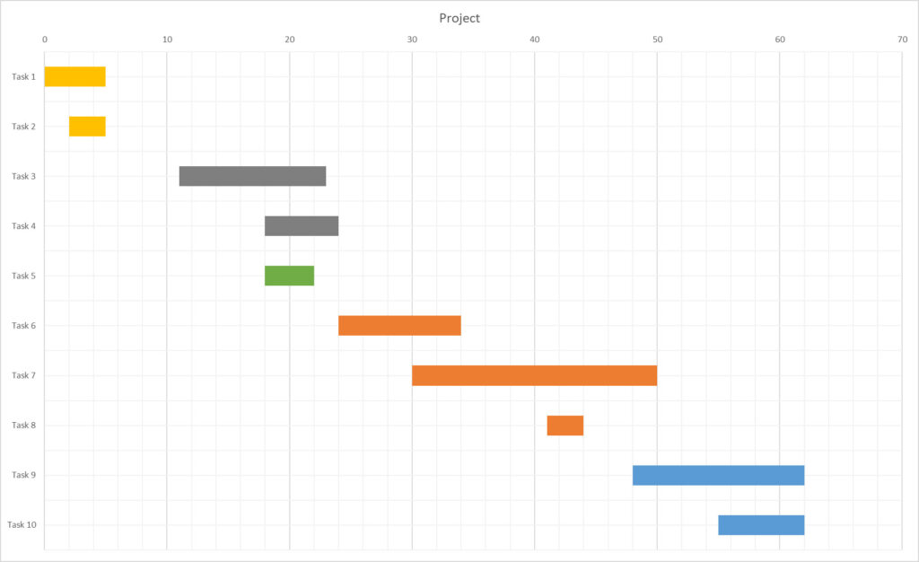
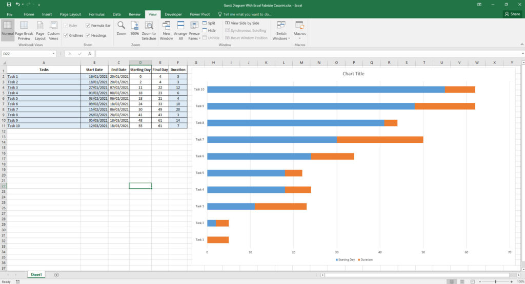
By clicking on the graph we will obtain the graph shown in figure 6
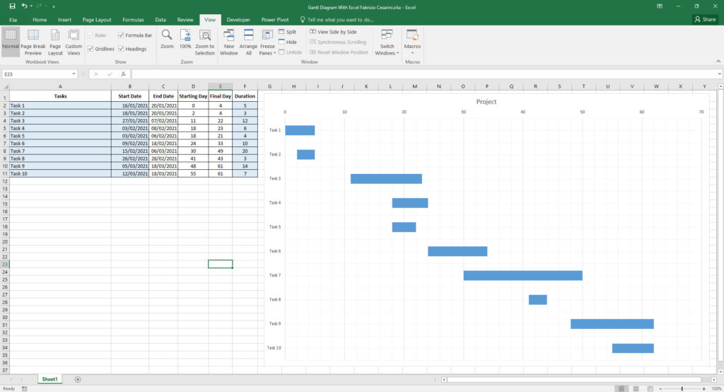
STEP 4: Modify the chart
What you have obtained is a chart that needs to be adjusted in order to be considered a Gantt chart. Just select the light blue bars and set the color to “No fill” and then we’ll go change the color of the remaining bars to light blue. Let’s set the title and remove the legend. Finally let’s remember to reverse the order of the Y axis.
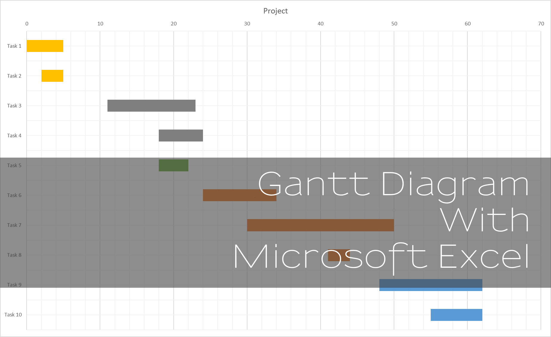
Finished! You have created your first Gantt chart with Microsoft Excel.
In the figure you can see the final result of the modifications.
Have fun using it!
FINAL NOTE
We can make a small but very useful change to the chart. Let’s imagine that we are managing a project and coordinating the work of a team of 3 people, each of whom must perform a series of tasks. These people, in jargon, are called resources. We could assign a color to each resource and set the color for each line of the diagram, giving it the color of the resource in charge of carrying it out. This simple and quick modification allows us to have an intuitive visualization of the project with the correct distribution of tasks to the resources. This allows us to highlight potential problems and make changes if, for example, we realize that we have assigned too many tasks to one resource and too few to another. The corrective action will allow us to have an optimal distribution of workloads.

CONCLUSIONS
What we have seen here is an extreme simplification of a very complex topic. The objective of this article is to bring people closer to this management methodology and to introduce them to this fantastic tool. This simplification is not suitable for very complex projects for which it will be necessary to use appropriate tools but in all other cases a simple chart with excel can be a really useful tool and, above all simple to create and use.
Keep following me. In the next articles I will come back to this topic and I will deepen many interesting aspects.
Stay tuned!