
Gauge chart with Excel
How to make a Gauge Chart with Microsoft Excel
Reading Time: 6 minutes
Post published on 01/07/2021 by Fabrizio Cesarini on site https://www.fabriziocesarini.com and released with licenza CC BY-NC-ND 3.0 IT (Creative Common – Attribuzione – Non commerciale – Non opere derivate 3.0 Italia)
Article Images credits and copyrights by Fabrizio Cesarini https://www.fabriziocesarini.com
Anyone who is involved with data will sooner or later need to show it. Communication plays a fundamental role in many disciplines and when dealing with numbers it becomes more complex.
It is not easy to communicate a number or a series of numbers because it depends very much on the type of data, the meaning of the data and who is reading the data.
To do this there are many techniques, both organisational and aesthetic. One can present a number in the form of an indicator and a series of numbers in the form of a table or graph. In turn, there are many types of graphs suitable for the specific purpose. What is more, for the same graph, the same data can be represented in many different ways.
Currently, there is a tendency to present this data in a synthetic form through a simple interface that shows, perhaps in an attractive way, all the data in a single panel called a Dashboard.
In this article, we are going to look at one of these dashboards, called Gauge, which is widely used, and we will learn how to create one easily using Microsoft Excel.
The aim is to provide our sheets with a new presentation tool that can help us show our data in the best possible way without having to use other external tools such as Microsoft PowerBI or Google Data Studio.
What is a Gauge and what is it for?
A Gauge (or rather Gauge Chart) is an indicator and is often also called a Speedometer Chart or Radial Gauge Chart and is very similar to the gauges we expect to find on a control panel or our car dashboard.
It serves to indicate a value within a range of values (minimum and maximum) perhaps giving a visual indication of the various areas within the range. This can be done using ‘notches’ or coloured areas to indicate the direction of the area itself.
The main purpose of the Gauge is to give an instantaneous view of a value and to understand the positioning of that value in relation to the minimum and maximum values. Basically it is used to tell the value where the value is in its context.
Microsoft Excel, up to version 2019, does not have the gauge chart among those available and therefore, if we do not want to do without it, we must use an external solution or we must engineer a little to find an alternative solution perhaps without making it too complicated.
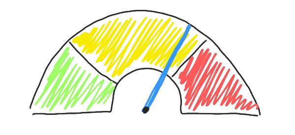
In this guide I will explain how it is possible, in only 3 steps, to create perfect Gauge Charts trying to obtain something similar to what I have schematised in figure 1 and whose result you can see at the end of this article.
Let’s go and do it …
Step 1 – The Data
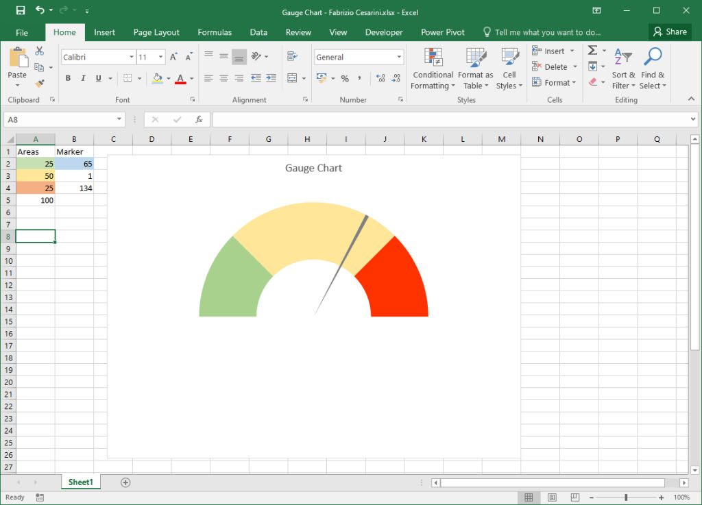
The first thing we need to do is to prepare the data structure and we need two columns. The first column, which we will call “Areas“, is used to create the half donut background with the 3 coloured areas. The second column we will call “Marker” is used to display the bar on a certain value.
In the example we are working on, we want to represent a gauge that can display values from a minimum of 0% to a maximum of 100%, and therefore the bar must indicate a value between these two extremes.
We also want to create our gauge with coloured indications for three different areas to indicate a certain level of attention. The idea is to have a first regular area indicated in green. A second larger area shown in yellow and a third smaller area coloured red. The concept we want to communicate is that the closer the bar is to a low value, the better, and the closer it is to a high value, the worse. The three areas will have different dimensions to express this concept. Since all values are in percentages we will have these 3 areas:
- Area A from 0% to 25% coloured green (25% wide)
- Area B from 26% to 75% coloured yellow (50% wide)
- Area C 76% to 100% coloured red (25% wide)
For our example we will set the bar at 65%, but of course you can choose any other value.
In order to do this we need 2 columns with the data shown in figure 2.
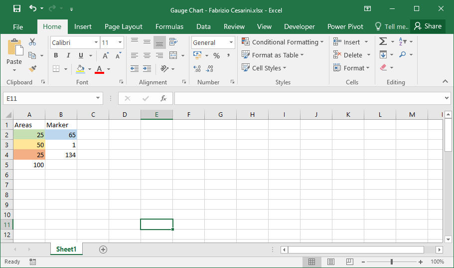
I explain the reason for the numbers in figure 2.
Since we are going to use a stratagem we need some additional data which will become clear later on. The column “Areas” shows the size of the 3 coloured areas of 25%, 50% and 25%. The number 100 will be used to draw the graph. In the “Marker” area, cell B2 contains the value that will be used to position the bar, which in this case is 65%. The number 1 indicates the thickness (in percentage) of the bar. Finally, the number 134 in cell B4 is calculated using the following formula:
In B4 we have = 200 – B3 – B2
It is essential that the number 200 is present. The reason for this will also become clear later on.
Step 2 – The Chart
Select the entire data area and in the “Insert” panel, go to the “Chart” section and select the first “Combo” chart. All steps are shown in figure 3.
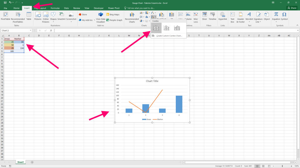
The graph we get is very different from what we want. Don’t worry because it will only take a few steps to turn it into a Gauge.
Step 3 – Customizations
Right-click on the chart and select “Change Chart Type” from the menu that appears. A panel will open where we can go to modify the two charts. We have created a chart by combining two different charts. By default it inserts histogram and lines. We need to transform them into “Donut” and “Pie“.
Therefore, select “Donut” under “Areas” and “Pie” under “Marker” as shown in figure 4.
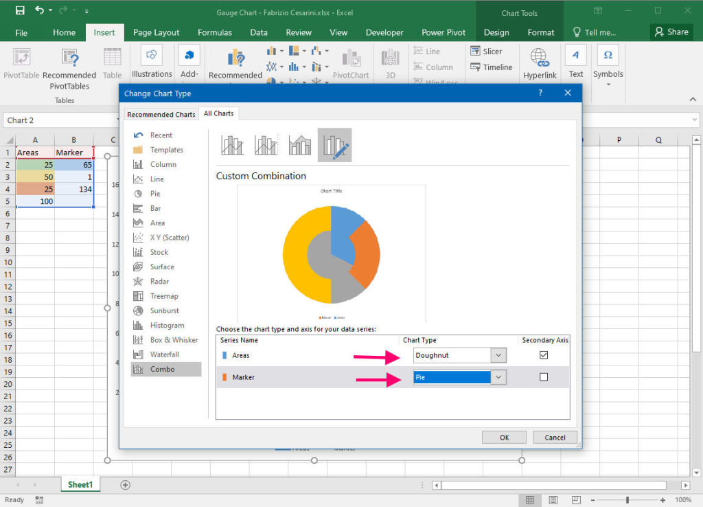
Select the graph Donut and by pressing the right mouse button select the item “Format Data Series“. In the left panel we set the parameter “Angle of first slice” to 270°. Repeat this operation with the Pie chart.
We have now flipped the two charts horizontally. Now we need to change the colours of the different areas.
Hide the areas we are not interested in and colour the areas we are interested in with the colours we want. In our case:
- hide the 100 (yellow) area of the donut
- colour the blue area (25%) of the donut green
- colour the red zone (50%) of the donut yellow
- colour the Grey zone (25%) of the Donut red
- hide the 65 (blue) zone of the Pie
- hide the 134 (Grey) zone of the Pie
- colour the area of 1 (Orange) Black
The result is shown in figure 5.
In the “Area” column the number 100 was needed to create the half of the Donut to be deleted and in the “Marker” area the number 200 was needed to maintain the proportions with the half of the Donut.
Conclusions
I have tried to make the article as simple as possible by showing how with just a few steps it is possible to create a good visualisation tool that can improve our dashboard without using other tools. Obviously, you can make all the changes you want by changing areas, sizes, colours, etc.
If you want, I’ll give you the file of this exercise. Connect with me on Linkedin and ask me the file on message.
Enjoy with it!