
Step Line Chart with Excel
A different way of drawing a line chart can solve many problems
Reading Time: 5 minutes
Post published on 07/07/2021 by Fabrizio Cesarini on site https://www.fabriziocesarini.com and released with licenza CC BY-NC-ND 3.0 IT (Creative Common – Attribuzione – Non commerciale – Non opere derivate 3.0 Italia)
Cover Image credits and copyrights by Mirco Bianchetti on Unsplash
Article Images credits and copyrights by Fabrizio Cesarini on https://www.fabriziocesarini.com
Those who operate in financial markets often need to visualize data in order to provide immediate visual information and therefore it is very important to choose the right type of chart to represent the data in the most correct and communicative way possible. Sometimes you also need to be able to do it “on the fly” without necessarily having to use some particular software and therefore it is natural to do it with Microsoft Excel. In the vast majority of cases Excel can perfectly give us what we need but there are some cases where this is not possible.
Let’s take the example of the quote chart of a financial asset. The correct way to visualize it is to use a Step Line chart but, almost always, it is visualized with a normal line chart.
Using an inadequate graph can lead to errors of interpretation of the data with of the consequent wrong decisions.
Comparing myself with many people, I realized that this problem often arises from the fact that our beloved Microsoft Excel, despite having a very high number of charts, does not have this type of chart among the default ones and therefore often we use the traditional line chart.
If we don’t want to install some external add-on, if we don’t want to use another software and if we don’t want to spend more money how can we do?
We have to use a little ingenuity to find a simple, no-cost solution.
I love finding alternative solutions
Follow me in this short guide and I will show you how to make a perfect Step Line Chart with a few simple steps.
What is a Step Line Chart and when is it used?
A Stepped Line Chart (also called Step Line Chart or, even more simply, Step Chart) is a chart made by a line that moves only horizontally and vertically. This type of chart is used to visualize a series of data with irregular intervals and, above all, when it is necessary to highlight the irregularity of the change. If a piece of data remains unchanged for a certain period of time and then undergoes a sudden change then this graph is suitable.
Normally a simple line graph is used but there are cases where this is not suitable.
A Line Chart shows the variation between one data point and another through the slope of the line itself and then emphasizes the trend of the data over time while a Step Line Chart shows a period without changes and then emphasizes the exact moment of the change and its strength.
This type of chart is often used in economics / finance.
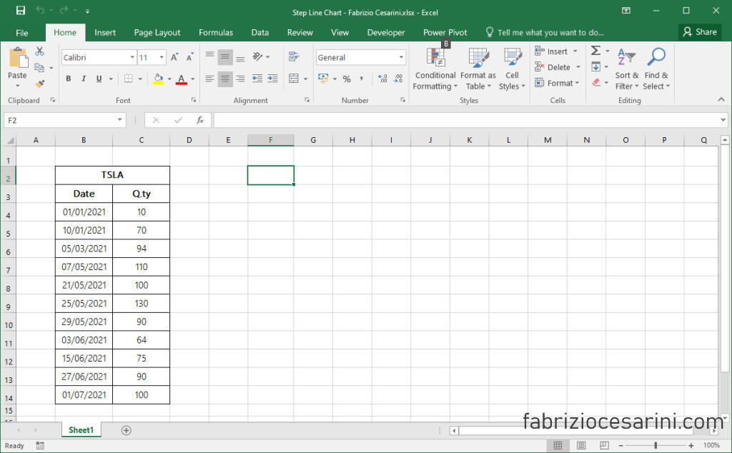
Data
In order to work on a concrete example, let’s use some simple data representing a hypothetical trend of the shares owned of a stock which in our case is Tesla Inc (TSLA).
The table will simply have to have two columns. The first column represents the date on which a change in shares held occurs and the second column represents the amount of shares held on that date.
Below is the table used for this example
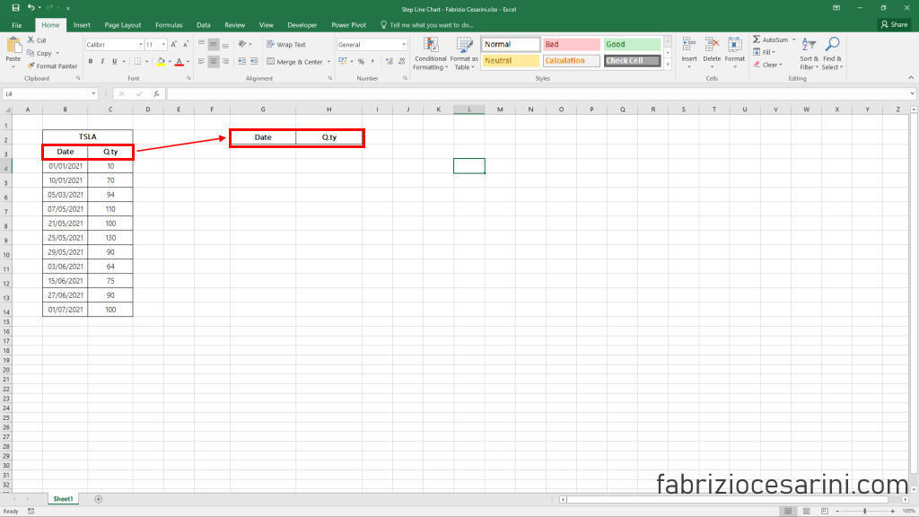
Step 1 – Prepare Data
The first thing we need to do is prepare the data in a particular way by doing some simple copy and paste operations. They may seem strange to you but they make sense.
Let’s copy the two column headings into a new cell (any) as shown in Figure 2
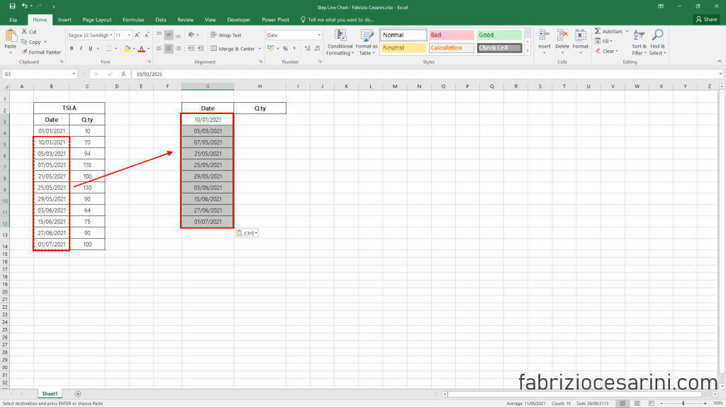
We copy the column of the dates excluding the first row as indicated in figure 3
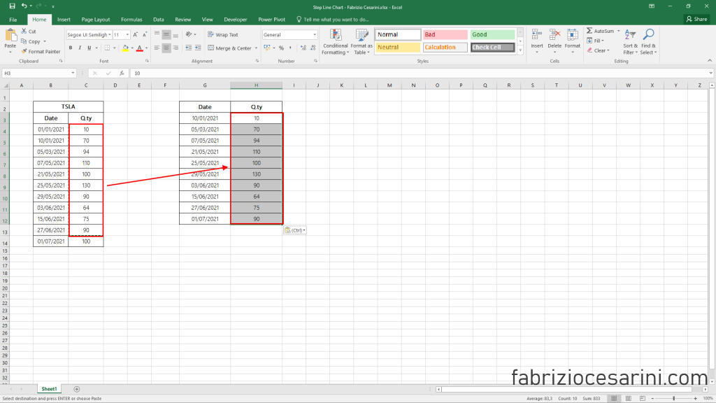
We copy the column of values excluding the last row as shown in figure 4
We copy all the data in the queue to the others as shown in figure 5
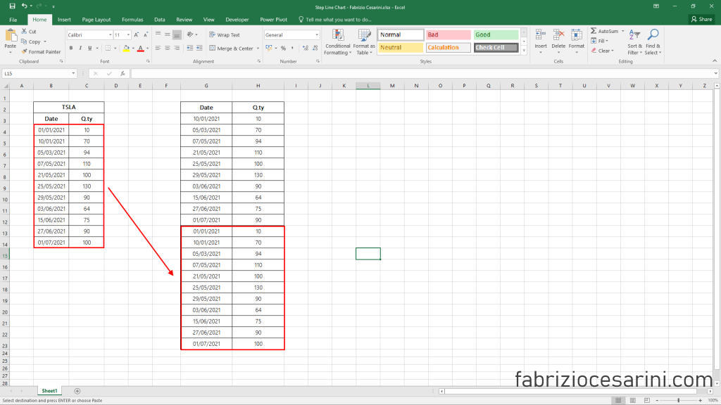
That’s all!
Step 2 – Chart
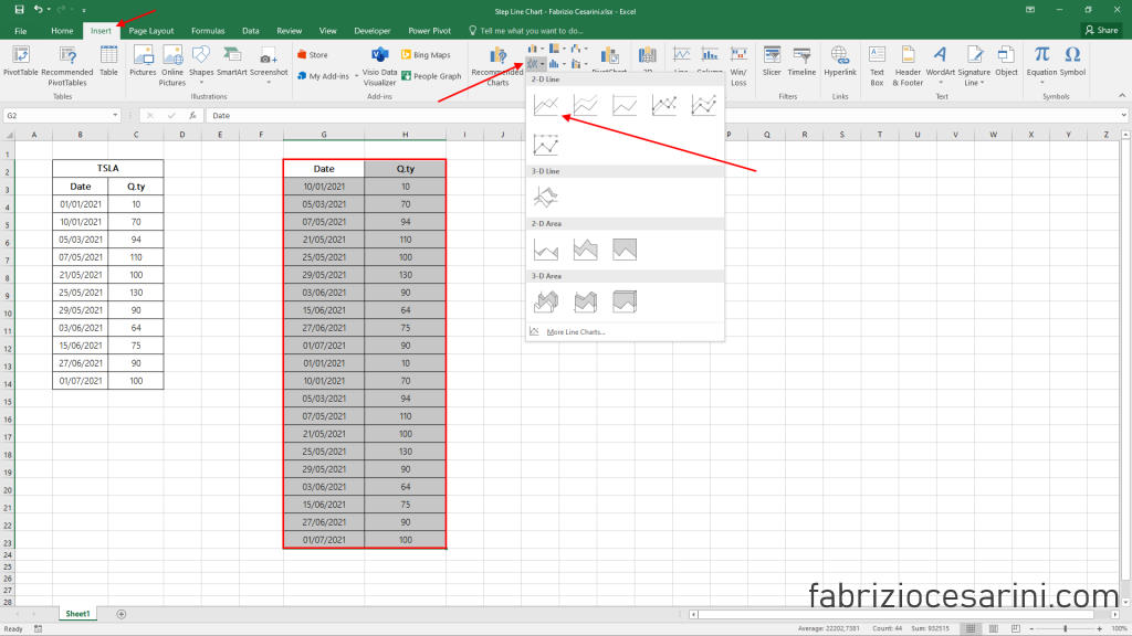
Now all we have to do is to select all the data of the table we have created, select the “Insert” panel, click on the Line Charts icon inside the “Charts” panel.
In the new menu that appears we have to select the first icon in the top left corner “2D line”.
These steps have been summarized in figure 6
What we will get is the graph shown in figure 7.
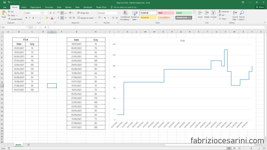
In figure 7 we can see the graph we wanted to get.
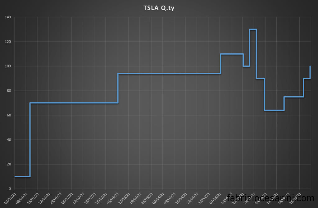
Step 3 – Customization
With a few simple customizations we can achieve a result similar to that shown in Figure 8.
Comparing Line Chart and Step Chart
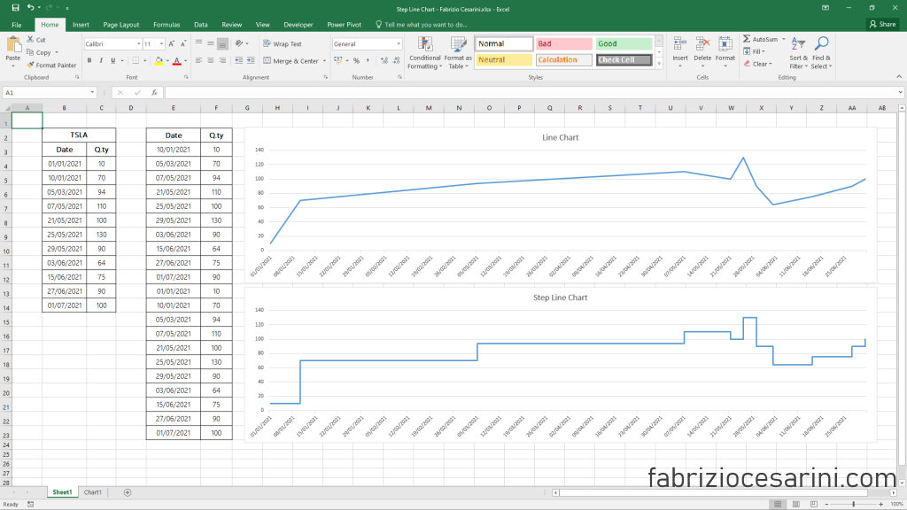
To more clearly understand the difference between this graph and a “traditional” one, I have created both graphs so that they can be quickly compared.
In figure 9 you can notice two graphs. The first graph on the top right is the Line Chart while the second on the bottom right is the Step Line Chart. It is very easy to notice the difference between the two charts and above all it is easy to understand the different level of communication that they are able to obtain.
Conclusions
There are several methods to create charts of this type but surely this is the easiest and fastest. Personally I recommend to create the chart using VBA code but it is undeniable that with a few clicks it is possible to get a great chart that until a few minutes ago was not possible to make in Excel.
I hope this simple article can be of help to you.
If you liked it share it with your contacts that you think may appreciate it and follow me on Linkedin.
If you want, I’ll give you the file of this exercise. Connect with me on Linkedin and ask me the file on message.
Enjoy with it!