Simple Gantt Chart Data Analysis with Microsoft Excel
Use the Gantt chart to extract useful information
Reading Time: 8 minutes
After creating our first Gantt chart for managing small projects we will see how to make our tool even more useful and powerful by adding a few simple elements. To simplify things in this article we will build on what we did in my previous article regarding data, table, formulas and chart. Therefore, in case you have not already done so, I invite you to go and read it HERE.
Our goal is to add some useful functionality in a simple way without complicating the starting file too much but at the same time being able to have a lot more useful information for project management. All this will be done without using the VBA programming language but only with formulas to be inserted in the cells and we will start to use our first and simple data analysis tools.
DATA
When we record the information related to a Task, we are inserting data in a table and these data, as such, contain information that we need to extract.
If you are interested in better understanding the difference between Data and Information I invite you to consult Donata Petrelli’s Blog that deals with these issues in a very simple and intuitive way.
This information can be easily extracted or, in some cases, require more work to be extracted. In our case, we will see how to extract some very simple information that gives us a measure of its potential.
The information that needs to be extracted depends a lot on the type of work that each of us does and the type of objectives that we want to achieve, but all of it must be extracted.
The management of a project includes a wide variety of skills and knowledge, but certainly involves a vast number of data-related topics.
THE TABLE
The first thing we need to do is to make the appropriate changes to the data table. To do this we load the data using the same data used in the previous article and that I invite you to go and read to better understand what we will do in this article.
For convenience in figure 1 is shown the data table used.
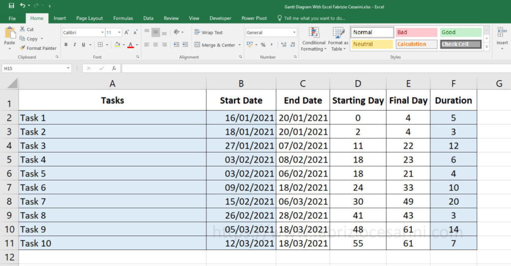
The first change to make is to add a cell at the bottom of column F that contains the durations of the individual Tasks. In our case those durations indicate days but could also indicate hours, weeks or months.
So, in cell F12, let’s insert the sum of the durations present in the column above. To do this, just add the following formula:
F12 = SUM ( F2 : F11 )
Figure 2 shows this operation
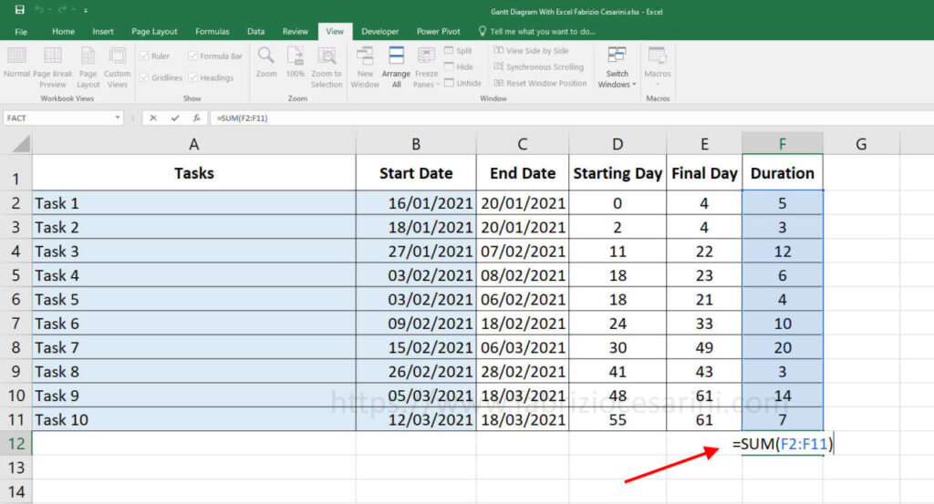
This sum, besides giving us a clear indication of the total duration of all the Tasks, will serve us for the calculation of the successive columns.
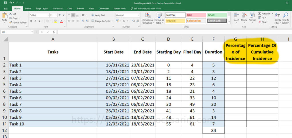
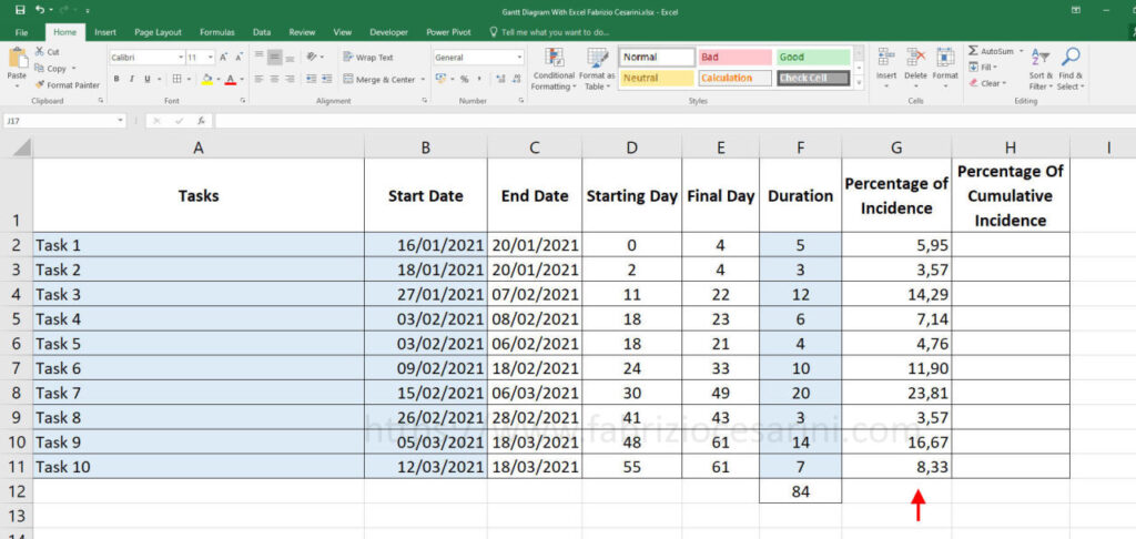
Let’s now add two new columns.
In column G we put the title “Percentage of Incidence” while in column H we put the title “Percentage of Cumulative Incidence“.
The result is visible in figure 3
DATA ANALYSIS
Column G “Percentage of Incidence” will contain a value (expressed as a percentage) indicating how much the specific task affects the total number of tasks. So we will get the useful information regarding the weight of a Task compared to the total weight of the project.
To do this we will use the cell with the sum of the durations of the Tasks we have created previously.
In cell G2 we are going to calculate the ratio between the duration of Task 1 (in row 2) and its total with a simple division remembering however to multiply the result by 100 so as to have the number expressed in percentage terms
Then in cell G2 we will put the following formula
G2 = F2 / $F$12 * 100
For the cell F12 containing the sum, we have used the $ symbol to fix the cell and to avoid that this cell changes during the operation of dragging the formula into the other cells.
Once copied the formula in the other cells and set the display of the cells to two decimal places only, we will obtain the result visible in figure 4.
Only one column remains to be calculated and then our work is almost done. At least the most complicated part is over.
In column H we want to calculate the progress of the work in percentage by adding up the percentages of the various Tasks. The result will be a number indicating the accumulation of percentages up to that point. Obviously the final sum will be 100%. This useful information will allow us to understand the distribution of the load of the jobs, if there are critical points, to understand when we are in the middle of the project or when we are towards the end and many other useful information that we will then go to represent visually. But for now, let’s focus on the calculation.
In the first cell we’ll simply report the first percentage value of the first Task and then in cell H2 we’ll insert the value of cell G2
H2 = G2
In the next cell (H3) we will put the sum of the previous value (H2) and the value of the current Task (G3) and then the formula will become
H3 = H2 + G3
Let’s drag this formula down to the other cells paying attention not to select cell H2 which contains the formula only for the first cell.
The result we will get will be the one shown in figure 5.
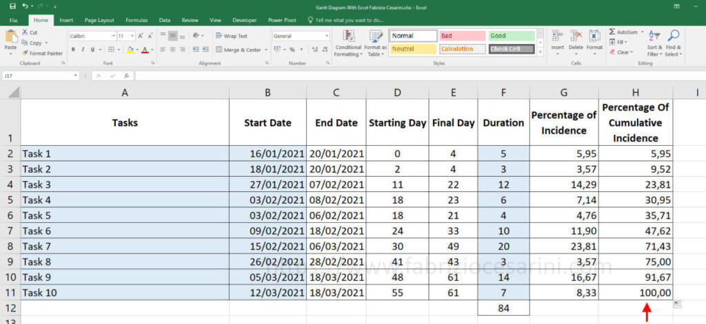
Also in this column we are going to set the number of decimal places to 2.
We have extracted useful information from the existing data. This information will have to be reported in the graph, but before doing so, it is important to modify the visualization of this information to make it more useful but certainly more readable and to have an immediacy of analysis.
TABULAR DATA VISUALIZATION
To do this we use an incredible tool in Excel and one that has been further enhanced in recent versions. Conditional formatting.
We select the column “Duration” and from the tool panel “Home” we select the icon “Conditional Formatting”. In the drop-down menu that appears, select the “Data Bars” item and then choose one of the icons with the “Solid Fill” and we will obtain the result shown in figure 6. In the same figure you will also find all the steps just mentioned.
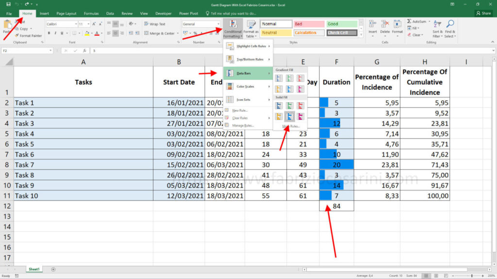
The choice of the blue color is absolutely up to personal taste but I suggest not to use neither yellow, nor red nor green to avoid that they give a wrong message. Colors have a precise meaning and using the wrong one can be a problem. Full style filling prevents misreading of information.
This conditional formatting allows you to get a quick glimpse of the duration of tasks by immediately highlighting the longest and shortest ones.
Now let’s select the “Percentage of Incidence” column and carry out a procedure similar to the one just done. Select the “Home” panel and then select the “Conditional Formatting” icon. In the drop-down menu that appears, select the “Color Scales” item and then the second icon in the upper left corner. All these steps are shown in figure 7 where you can also see the final result.
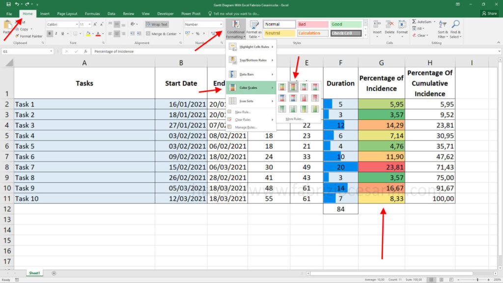
This time we have used the conditional formatting tool to highlight the tasks with the highest duration with the red color, those with the lowest duration with the green color and those in between with the yellow color. This also gives us visually a clear and fast idea of the tasks.
What we have obtained is a better representation of numerical data
GRAPH
The last step of this short guide is to add the processed data on the Gantt chart.
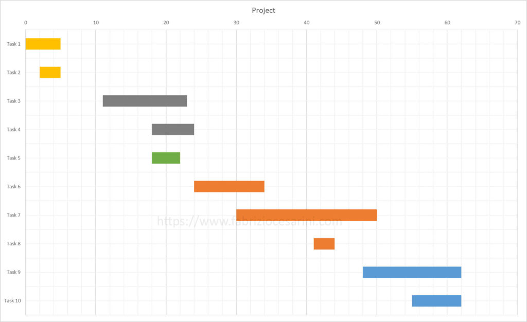
To do this we use the chart created in the previous post and that you find in figure 8.
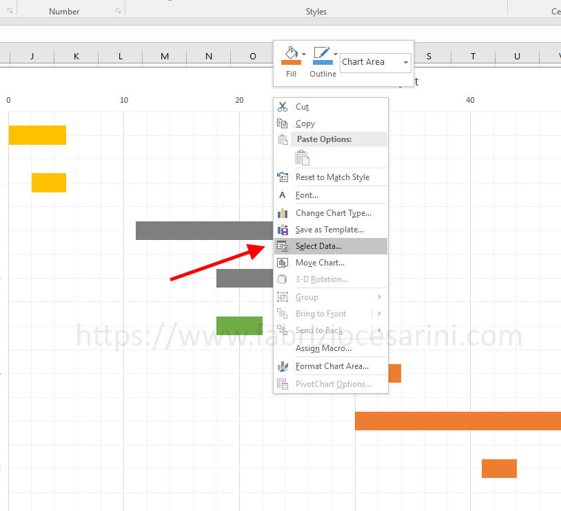
We click with the right mouse button inside the chart area and get a menu with all options related to the chart. From this menu we select the item “Select Data” as shown in figure 9.
A new panel “Select Data Source” will appear where we can manage the data sources of the chart. On this panel click on the “Add” button to add a new data set. You can see this step in Figure 10.
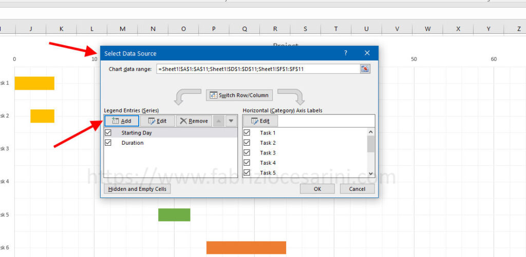
A new panel will give us the possibility to insert the new data to be added. We must indicate the cell containing the name of the series that in our case is H1 and indicate the series of data to be inserted that in our case go from H2 to 11 inclusive. In figure 11 you can see the panel and the data to be inserted.
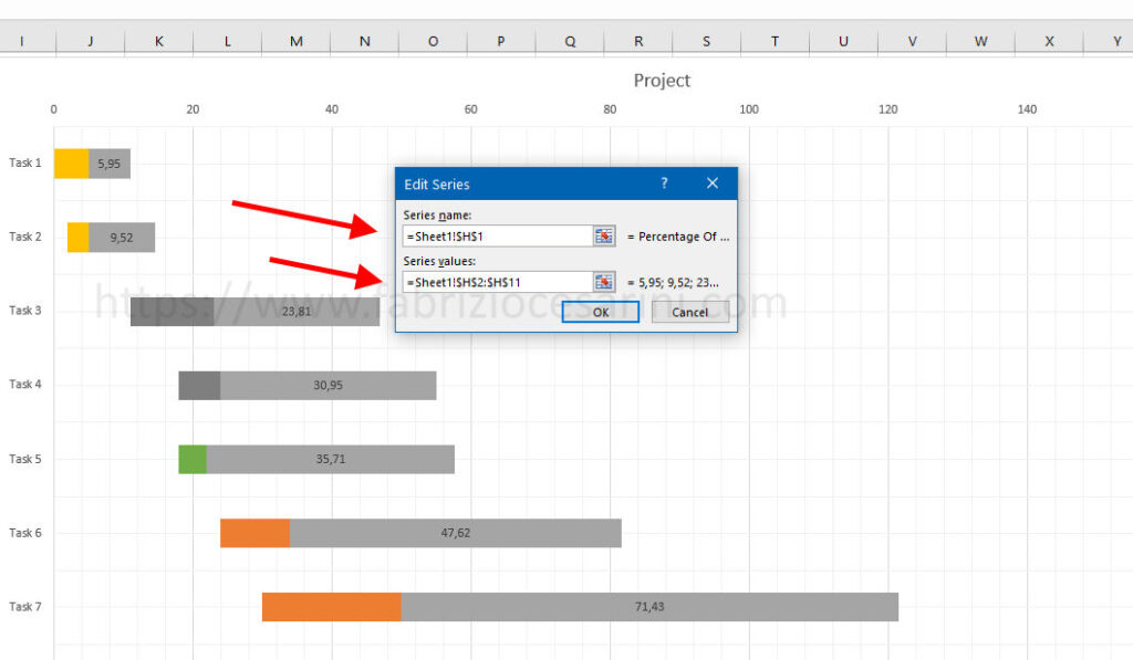
As you can see in figure 11 by adding this new data series the chart will undergo a change.
We need to go and modify the new data series and to do this we select this series in the chart and with the right mouse button, from the menu that appears, select the item “Change Series Chart Type” as shown in figure 12.
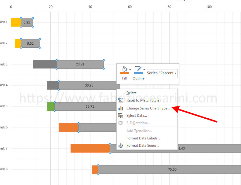
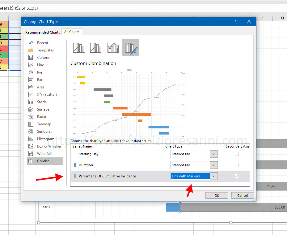
A window will open where you can set the graph type for the various data series.
All we have to do is choose “Line with Markers” as the graph type for the “Percentage Of Cumulative Incidence” series as shown in Figure 13.
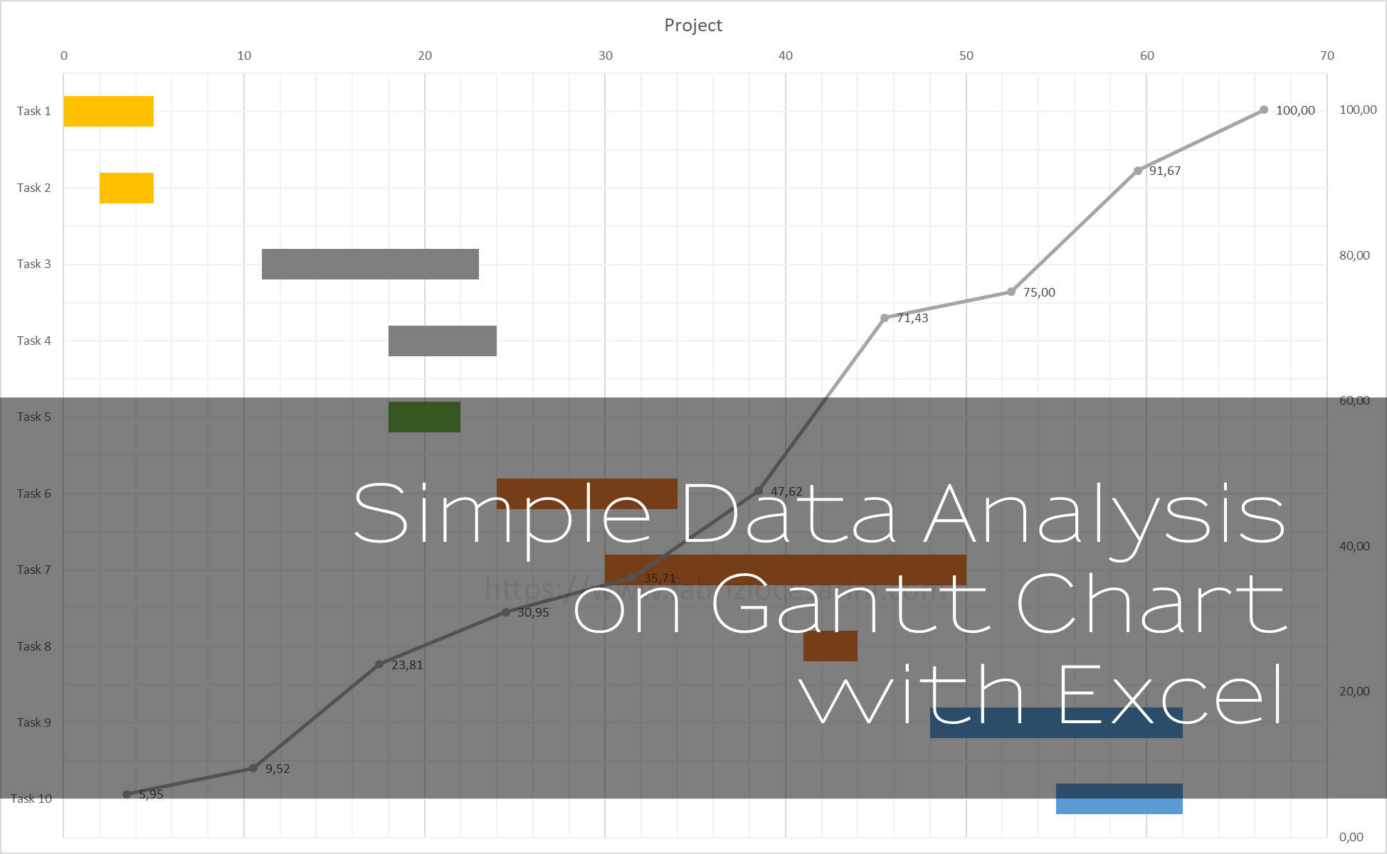
The final result of our work will be as shown in figure 14
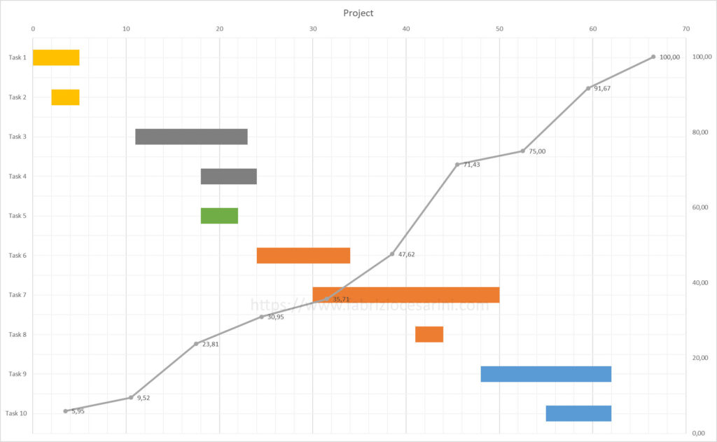
Now our Gantt chart contains a useful bar showing the distribution of the project from start to completion with indications of the cumulative percentages for each task. With little work we have added visual information to the existing chart.
CONCLUSIONS
We added a couple of columns and calculated values on these columns by processing existing data. This processing allowed us to extract useful information from the data and we displayed it more clearly to make it even more useful.
Having done this we have added useful graphical information to the existing graph.
These are just examples of how it is possible to perform numerical analysis on the data of a Gantt chart. These same computations can be carried over to other areas as well.
In doing so, we have created a useful project management tool with our powerful Microsoft Excel, but we have also seen how to extract useful information and display it.
Keep following along. I’ll be coming back to these topics.